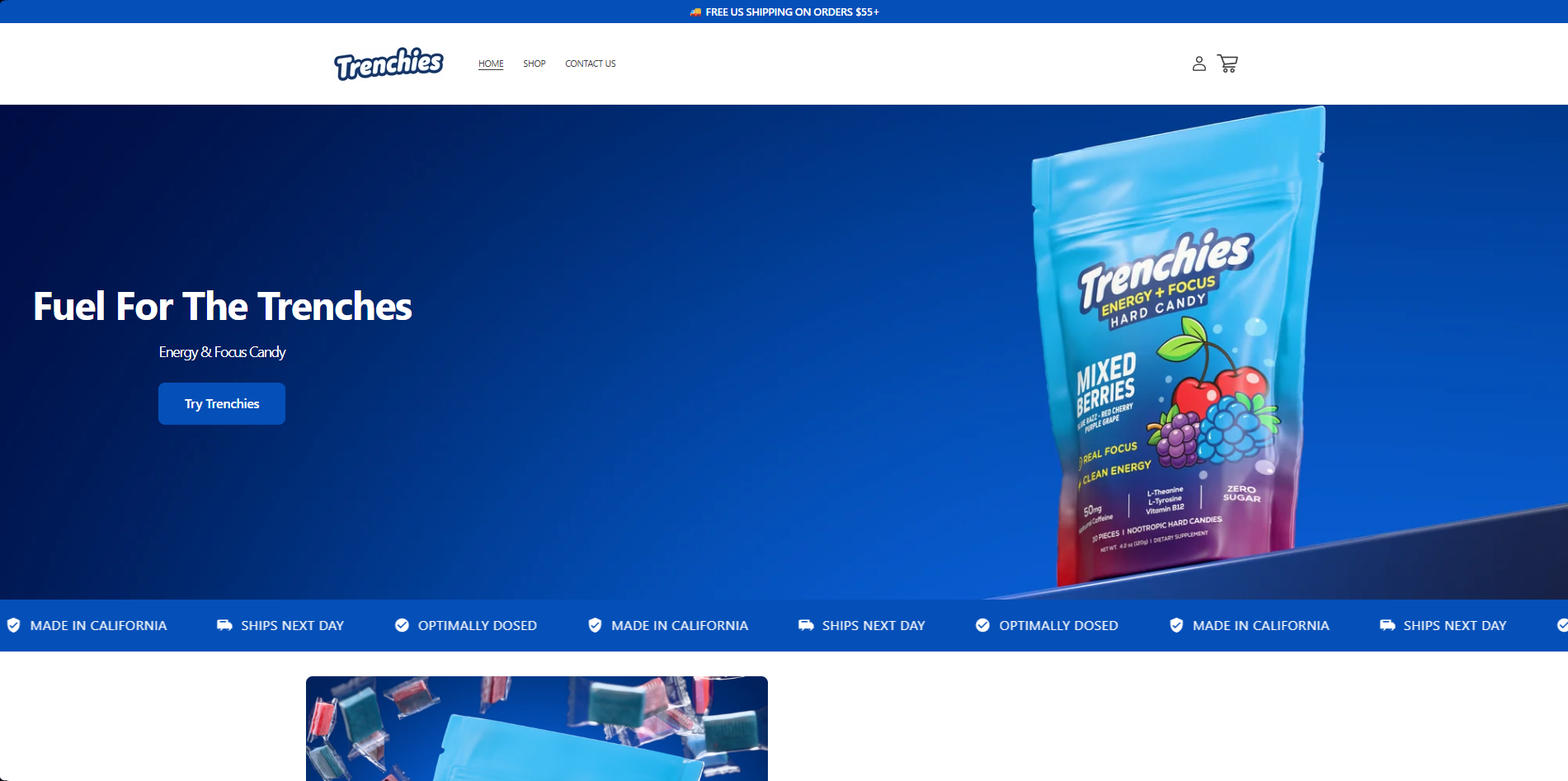

A quiet, cinematic brand site for a Japanese wellness label — heritage storytelling, minimal chrome, calm commerce.
Wellness without the noise.
Izanami wanted a site that felt closer to a gallery than a storefront. Craft, calm, and clarity — no popups, no gradients, no cliché wellness aesthetic.
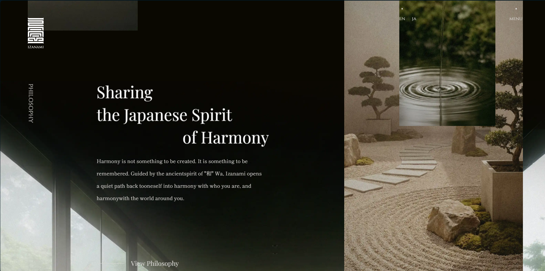
Type-led, image-anchored.
Slow scroll pacing, wide margins, and Japanese type as an active design element. Every product page reads like a chapter, not a listing.
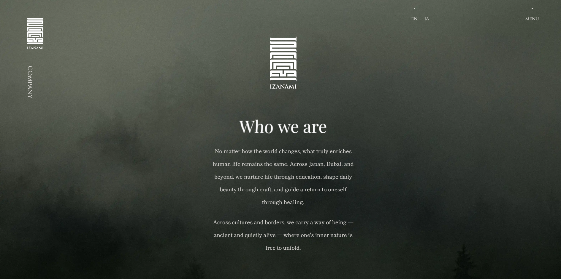
Under a second, everywhere.
The full site loads under a second on 4G. Image-heavy pages stream via responsive AVIF, and the checkout is a single-page overlay that never leaves the story.

$95K+ in the first month.
Izanami's launch pulled in six figures inside the first thirty days, with an average session time nearly triple the wellness category average. The site is doing exactly what it was designed to do — hold attention.